Deciphering Handwritten Arabic: How To Read Arabic Written By Hand
Before we get started: Did you come here to learn how to read and write the Arabic alphabet in general? You’re in the wrong place! This article is about learning how to read Arabic handwriting.
Read my article on learning the Arabic alphabet.
How to read Arabic written by hand
Handwritten Arabic is quite a challenge for someone like me, to whom even my own handwriting in my native language can be hard to decipher or to decode.
If you’re learning the Arabic language mainly to communicate by speech or online, or to read books and newspapers, reading fluency with a nice, printed script will suffice. If you’re going to work professionally with the Arabic language on some point, however, or if you plan on living in an Arab country or study abroad, it remains very important to be able to read the alphabet when written by hand, and to recognize the different Arabic handwriting styles.
For working with translation, or in various governmental institutions, you may come across handwritten Arabic quite often, since many official documents can be partially or even completely written by hand.
So you’ve got to learn to read Arabic handwriting!
Arabic handwriting is in fact another script
One of the reasons for the difference between handwritten Arabic and the printed style is, that the font we know from printed Arabic in books, publications and on the computer, is based of the calligraphic style called “Naskh” whereas handwritten Arabic adopts many tendencies from another style, “Ruq’ah”.
Although the difference can, at first, seem like a big obstacle in decrypting notes and scribbles done by hand, it really comes down to a few letters, or general tendencies that are quite easy to grasp. Once you’ve got an idea, you only need a little exposure to real hand-written Arabic, and you’ll soon be a fluent reader, even when the text is written more loosely.
Below, I’m going to go through a number of observations that I have made in the difference between printed and handwritten text. The examples are based on a few text-examples that I’ve borrowed from the “KHATT” archive, which is an Archive of over 2000 scans of handwritten Arabic with corresponding digitized text.
This collection is made for the purpose of research, but It is also a great tool and resource for practicing reading handwritten and digital texts in parallel. I have included a few of the texts on this page along with individual notes for half of them, and I hope that you’ll find them as useful as I have.
If you wish to dig deeper into the subject of Arabic handwriting, I recommend the book “Mastering Arabic Script” by Mahmood Gafaar and Jane Wightwick which goes into detail in explaining the difference of each letter in its printed as well as handwritten form. The book is also a great introduction to the Arabic script for reading as well as writing in general. Especially since it focuses on the Ruq’ah script - something many resources ignore.
If you have any questions or suggestions, I’d be happy to hear them! Either post a comment below, or send me an email through my Contact page. I’d also appreciate if you would share this article if you know someone to whom it might benefit.
Different Letters In Handwritten Arabic That You Should Look For
ا , alif
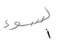
alif The initial alif is sometimes drawn below the word, appearing to being something separate from the word in question.
ت , tāʼ
tāʼ The tāʼ very often appear with a horizontal line floating above instead of the two dots.
ث, thāʼ
thāʼ The dots of the thāʼ is also sometimes changed, but to a reversed “v” shape, or something that resembles the accent mark ”^”.
ج, jīm
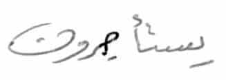
jīm You’ll often see the jīm “closed” with a line crossing over the part that normally stands open.
ح, ḥāʼ
ḥāʼ See jīm and khāʼ
خ, khāʼ

khāʼ Like jīm and ḥāʼ, khāʼ is often drawn with a line crossing over the part that is usually open.
ط, ṭāʼ
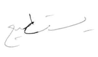
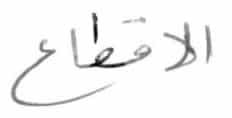
ṭāʼ When writing the ṭāʼ (as well as the ẓāʼ) the vertical line is added after the writing of the circular shape. This sometimes means that the two shapes appear dis-joined, or more or less unrecognizable.
ظ, ẓāʼ
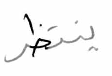
ẓāʼ In this example, the ẓāʼ is written like a closed khāʼ with an added and disjoined vertical line.
ك, kāf
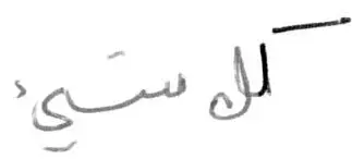
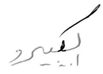

kāf The kāf can take multiple shapes, like the first two examples as the initial or middle positioned letter in a word, where it is can be composed of two, dis-joined lines; or that of the final letter, where it is drawn like a spiral-shape rather than the floating “s” symbol, you often see in the printed, final kāf.
ل , lām

lām The lām can, especially when joined to an Alif resemble a “A” shape instead of being a vertical line.
م, mīm

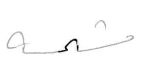

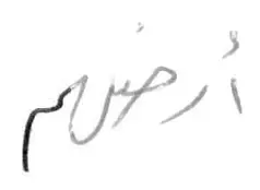
The mīm can take many different shapes depending on the style of the writer and the position of the letter. In most printed texts, the mīm is drawn like a little closed circle that follows the direction of the writing, but done by hand, it isn’t always so. The initial mīm illustrated to the left is formed by a small “roundish” shape, that often takes the line back towards the right before continuing to the left.
It is mostly not a closed shape, but open in the bottom. Sometimes the mīm is drawn only with a simple dot, especially when it is “stacked” with its surrounded letters (scroll down to see examples of letter-stacking) Do also notice the final image, where the curved shape of the mīm is reversed and facing downwards instead of up.
ن , nūn
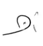
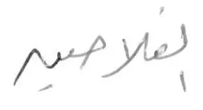
The nūn can be drawn as an almost closed shape like the example to the left. In some cases, when the letter is in the final position, the dot above the nūn (and other letters like qāf and ḍād) can be substituted by making an angular “A” shape following the letter.
ص , ṣād
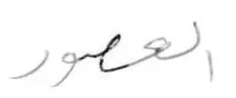
The ṣād, when written quickly, can sometimes look like an “e” shape with a lot of free space below the closed circle of the letter. Note that the small angular shape before the wāw is almost always included in drawing the ṣād (and ḍād), which can help recognize it, if the rest of the letter appears different than usual.
ض , ḍād
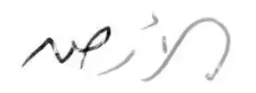
Like it is the case with the nūn, the dot above the ḍād can sometimes be substituted by an angular “A” shape, when the letter is in its final position.
ق , qāf

Like with the ḍād and the nūn, the dots above the qāf letter can be replaced by an Angular “A” shape when the qāf is the last letter of the word. Note here, that the hollow of the letter-shape is drawn very small, and that it therefore is hard to recognize as a qāf.
س , sīn

Note how the sīn (as well as the shīn), when unconnected to its preceding letter (or in initial position), can begin with a sharp angular shape, and how the waves along the letter are often replaced with just a straight line.
ش , shīn
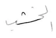
The shīn is often drawn without any “waves”, making it seem like a straight line. The three dots above the letter are often replaced by a little bow, like it is the case with “Tha”.
ه , hāʼ
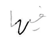

The hāʼin the middle position, often takes the shape of a deep “U” going downwards. In the final position, some writers will draw the letter like it is drawn in its initial position.
ي , yāʼ

The yāʼ (or in this case, Alif Maqsura) can sometimes be drawn with its tail going backwards, rather than making the “S” shape which is most common in printed text. In this case, the letter is drawn from the top of the preceding lām, instead of its bottom.
Stacked letters
It is very common to write connected letters on top of each other. This also happens in printed text from time to time, and it is something which is very important to be able to read. Below are a few examples of how it is done.
عمـ, ‘ayn-mīm
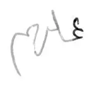
Here, the Ain is stacked on top of the mīm, which makes it look like two Ain shapes are repeated.
جمـ , Jīm-mīm
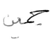
A jīm stacked on top of a mīm.
لجمـ , lām-Jīm-mīm
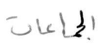
An example of three letters stacked on top of one another.
لمـ , lām-mīm
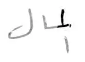
Note how the mīm is only drawn as a dot, and how it recedes behind the lām which is actually written first.
ـتحـ , tāʼ-ḥāʼ
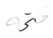
It can be difficult to make out the ḥāʼ in this example, because it is drawn in a much less accentuated way, that you might be used to seeing.
يحـ , yāʼ-ḥāʼ
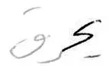
Note how the initial yāʼ is only hinted at very lightly by a slight angle downward in the hollowing ḥāʼ. The line that replaces the two dots of the yāʼ beneath helps us guess that it is indeed a yāʼ.
يمـ , yāʼ-mīm
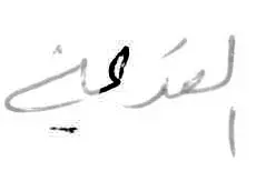
Here, it is difficult to make out the yāʼ, especially because the dot (line) markings below are drawn further along the word instead of where you’d expect them as a debutant. The mīm, too, is difficult to guess because it is drawn only as a dot.
A few examples of handwritten texts
و أنه لم يحضر للتمزيق و التخريب و ان أهلهـ لو أرادو به السوء لقدموه فيك كل شيئ لنقع الحسدهـ به . بل ما أكل منه اذا اجييئ به الا العاتب و إلا الذي لم يرهـ كان يدفع يدهـ و لم ينتظر غيرهـ و كذلك قال أبو الحارث´جمين حبين رآهـ لا يمس هذا المدفوع عنه و لولا أنه ذلك شاهد الناس

1: Note how the hāʼ is used in the form that you would normally only use when the letter is the first one in the word; 2: Sometimes the Alif is written below the word; 3: Look at this kāf where the letter, in its initial position, is made of two unconnected lines; 4: This looks like a kāf, but it’s a lām on top of a hāʼ; 5: Note how the mīm is only a point and that the line continues from the right over the letter; 6: Note how the lām goes beneath the mīm to draw it from beneath, and forming the letter to the right. This is also current in printed text;__7: sometimes the vertical line in ẓāʼ and ṭāʼ doesn’t touch the shape below; 8: Here the jīm joins the mīm from above, still forming its shape to the right.
وكانت تدفأ من وسطها من موقد يحرق فيه الخشب وظلت الدار من غير مدخنه الى أواخر العصور الوسطى ، وكان الدخان يخرج من فتحه بالسقف ، وكان من خلف المصطبه باب يوصل الى ” مشمسه ” يستطيع السيد وأسرته وضيفه أن يستريحوا فيها ويستمعوا بأشعة الشمس وكان الأثاث هنا أدعى الى الراحه منه فى الحجرات .
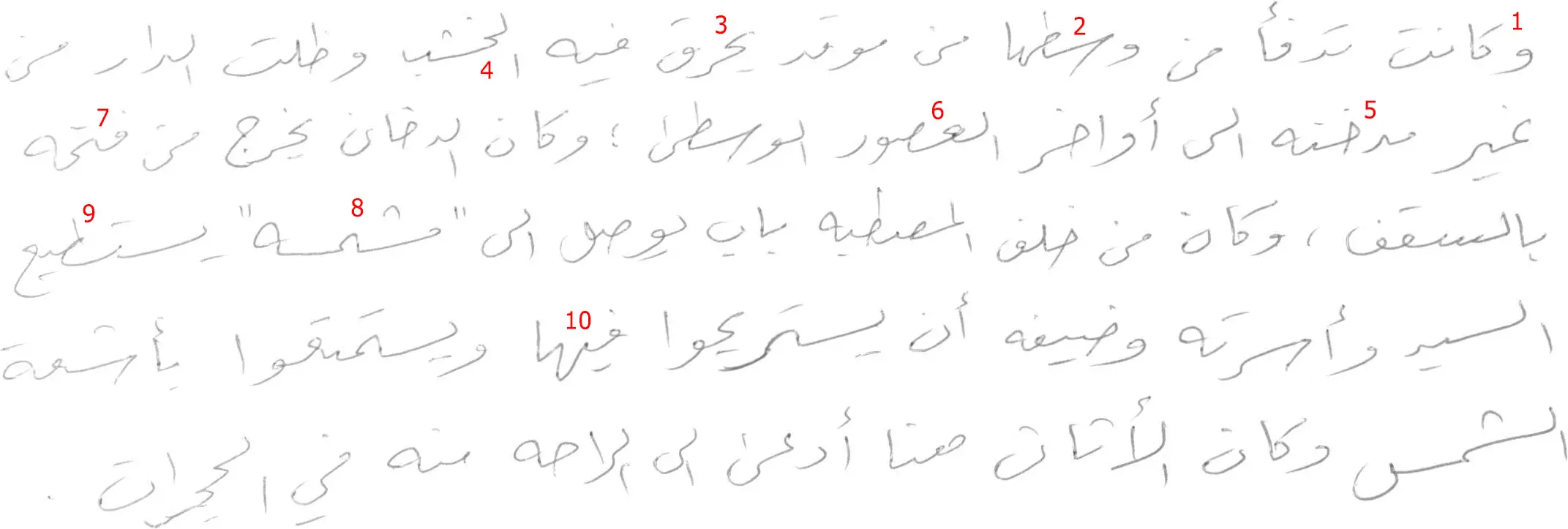
1: Here, again, the kāf is drawn by two lines, not meeting each other, one horizontal and one vertical; 2: Notice how the initial sīn is drawn like a sharp angle form below, and how the ṭāʼ has its vertical line “floating” above the shape; 3**:** The initial yāʼ is placed “on top” of the ḥāʼ, which is drawn beginning from the left, creating a “s” shape; 4**:** The initial Alif is drawn below, and the shīn is doesn’t have its buckles. The three dots are replaced by a little bow; 5**:** See how the khāʼ is closed with the crossing line; 6: Here, the ṣād is drawn from below; 7**:** Here, the hāʼ is only shown as a slight bulge in the descending line following the tāʼ; 8**:** Both the shīn and the sīn are represented as horizontal lines. The mīm in the middle is almost invisible, only hinted at by a very slight “corner” on the bulge between the two letters; 9: Note how the ṭāʼ is drawn from below, almost without the main shape; 10: The hāʼ is represented by a “v” shape.
وكان أبناؤها يتلقون تعليماً يختلف كل الاختلاف عن تعليم الجماعات . لإن أبناء الأشراف قلما كانوا يرسلون إلى المدارس العامة ، ولم يكن في كثير من الحالات يبذل أى مجهود فى سبيل تعليمهم القراءة . ذلك أن القراءة والكتابة كانتا تتركان للقساوسة والكتبة الذين يستأجرون بأقل الأجور . وأن الكثرة الغالبة من فرسان الاقطاع .

1: Here, the kāf is drawn with a line floating above a bulge that then goes to form the next letter; 2: Another example of the mīm being formed by first a small hill, then by a very concentrated point, joined from above, where you almost cannot see the round shape; 3**:** the initial yāʼ is drawn by a slight down tilted line before forming the khāʼ; 4: The lām-Alif shape is drawn by adding a little vertical line to a reversed “v” shape; 5: Three letters are stacked on top of each other - lām, jīm and hāʼ; 6: Note how the shīn if formed by a sharp edge from below. The Alif after the rāʼ is floating a little above the rest; 7: The final kāf is drawn like a simple spiral-shape; 8: The initial Alif is dropped down below the rest of the letters; 9: The jīm crosses itself rather than stay open; 10: The vertical line of the ṭāʼ is floating a bit above the rest of the shape.
وأراد سادة الإقطاع أن يستبقوا الفلاحين في أرضهم ، ويجعلوا عملهم مربحاً لأولئك السادة ، فاستبدولوا بالقروص الإقطاعية القديمة مقادير من المال تؤدي دفعة واحدة ، وباعوا أرقاء الأرض حريتهم بأثمان يؤدونها من مدخراتهم ، وأجروا مساحات متزايدة # من أرضهم إلى الفلاحين الأحرار بأجر نقدي ، واستأجروا عمالاً أحراراً يعملون
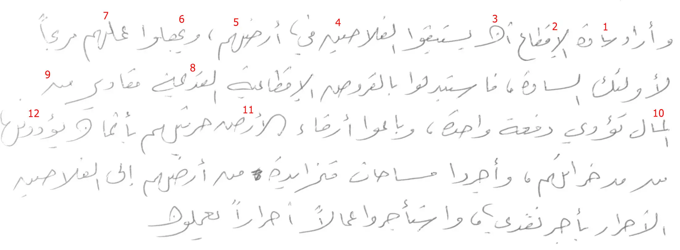
1: Notice the sīn, which is drawn like a sharp angle coming from below, and joining a very small Alif. The dāl seems to join the following letter; 2: The initial Alif is dropped down below and the lām-Alif looks almost like a “y”. The ṭāʼ in disjoined, and has its vertical line floating above the shape; 3: Note how the nūn seems to be turned on its side; 4: See how the ḥāʼ is “crossing itself” and how the final nūn lacks its dot, and appears like a “N” shape; 5: See how the hāʼ looks like a big “U” dropping down, and how the mīm has its top “Bulge” turned down instead of up; 6: The yāʼ is stacked on top of the ḥāʼ; 7: The initial ʻayn in stacked on top of a mīm that is drawn as only a dot from the left. This way the ʻayn and mīm look alike. Also notice the hāʼ that looks like a deep “U” shape”; 8: Here, it can be hard to work out that a yāʼ is stacked on top of a mīm; 9: Note how the final nūn can be drawn with a “N” shape; 10: Here, the Alif is dropped-down, and a mīm is placed before the lām; 11: The first Alif is connected to the lām, forming a bow. Note how the ḍād is followed by a “N” shape in stead of the dot; 12: The wāw and the dāl look alike here. Notice the U-shaped hāʼ and the mīm that goes upwards.
وكان قرب المدن المزدحمة مشجعاً على تربية الماشيه. وصناعة منتجات الألبان وغرس حدائق الخضر وجرت السفن فى في الازدهار وفي البرو البحر من الأف الكروم المنتشرة في أودية التيبر و الأرنود البود الواددي الكبيرو التاجه والإبرة والرون والجروند و الجارون و اللوار والسين والموزل و الموز.
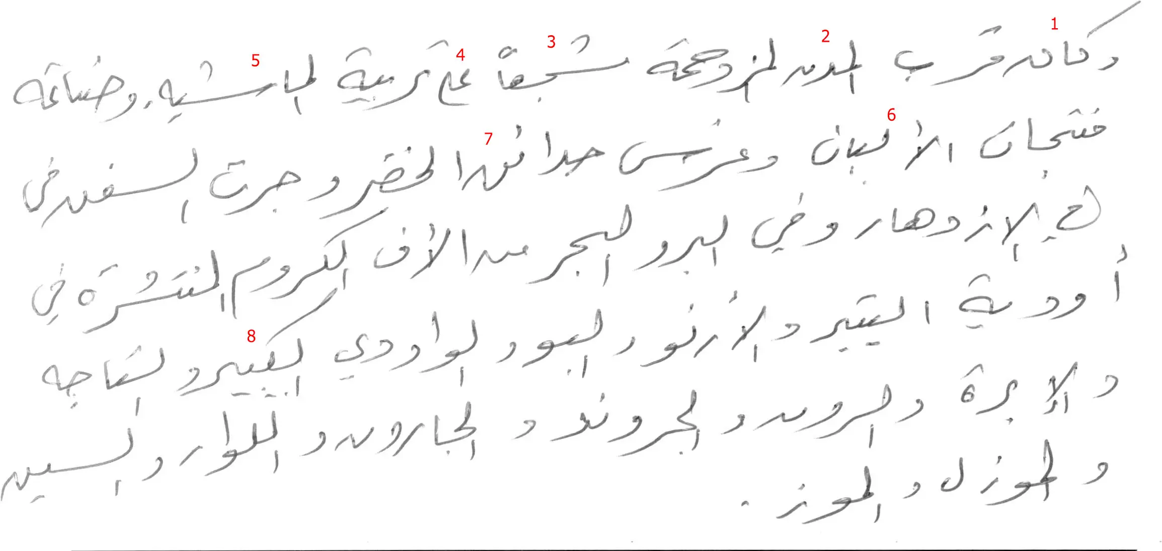
1: The wāw is small and what is normally a round shape, is drawn as a small dot. The following kāf has two unconnected lines, and the nūn takes a sharp angle downwards instead of using the dot on top; 2: With the Alif below and the mīm going backwards behind the lām, it appears to be a cross shape; 2: The ḥāʼ is closed by the line crossing, and it is drawn above the following mīm; 3: The initial mīm is but a dot, the shīn is only a line without waves and the three dots are represented by a bow. The letter joins the jīm from above; 4: The lām is not very tall, and it goes to join the yāʼ from above. The yāʼ is drawn like a curve going backwards; 5: The shīn in its middle - position sometimes is drawn with a sharp angle in the beginning; 6: The Alif following the lām looks like a “y” shape, the second Alif following the “Ba” is not very tall; 7: Not how the final qāf has a very small “round” shape, and that instead of the two dots, it is followed by why looks like a reversed “V”; 8: Note how the kāf in its middle-position has its angled like in top added after the drawing of the word, and how it allows for the following “Ba” to be connected;
And a few texts without my notes
فكانت الأرض تزرع كل عام ولكن خصبها كان يجدد مرة كل ثلاث سنين بزرع لكلأ الذى يتخذ غذاء للحيوان أو البقول . وكان زوجان من الثيران القويــــة جران المحاريث ذات الســـهام الحديدية تتعمق الارض أكثر من ذى قبل ير الكثرة الغالبــــه من المحاريث ظلت مع ذلك تضع من الخشب

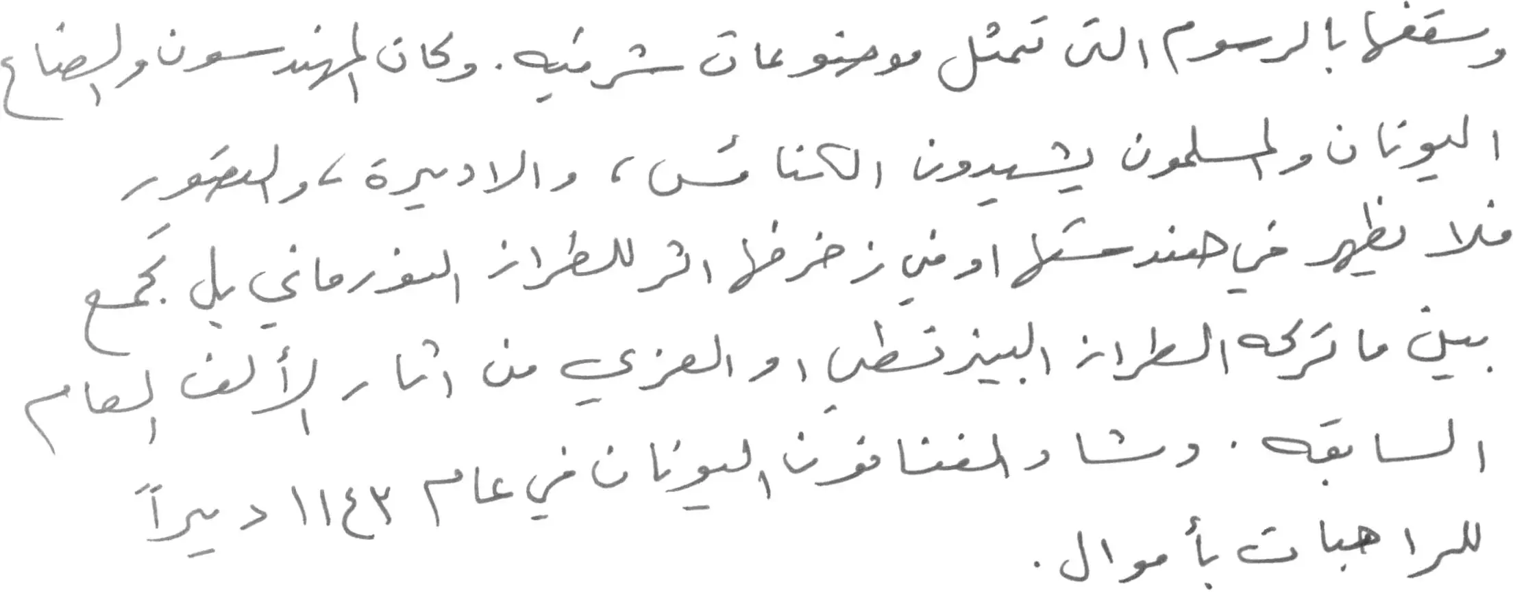
وسقفها بالرسوم التى تمثيل موضوعات شرقيه . وكان المهندسون والصناع اليونان والمسلمون يشيدون الكنائس ، والاديرة ، والقصور لا يظهر في هندستها او فى زخرفها اثر للطراز النورماني بل تجمع ين ماتركه الطراز البيزنطى اوالعربى من اثار الألف العام السابقه . وشاء الفنانون اليونان في عام 1143 ديراً للراهبات بأموال
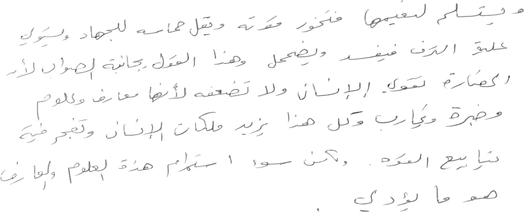
هذه هي المراحل الأربعة في تطور الحضارات عند ابن خلدون وقد تطول إلى ستة مراحل وقد تقتصر على ثلاثه فقط . وهذه الأطوار الحضارية والتدرج في مراتب الحضارة حتى اثدثارها يعود - كما يقول أصحاب هذه النظرية - ألى أن الحضارة تضعف من يملك أسبابها ويطمئن إليها

ويتسلم لنعيمها فتخور قوته ويقل حماسه للجهاد ويستولى علية الترف فيفسد ويضمحل وهذا القول يجانبة الصواب لأن الحضارة تقوي الإنسان ولا تضعفه لأنها معارف وعلوم وخبرة وتجارب وكل هذا يزيد ملكات الإنسان وتفجر فية نيابيع القوه . ولكن سوء ا ستخدام هذة العلوم والمعارف هو ما يؤدى
وترفض أى احتمال بالمادة من أصل إبراز النموذج الروحي الصرف على البشرية و الإنسانية جمعاء , و قد تقلص دور و وظيفة هذه الأنواع من الحضارات على تأكيد ضرورة و أهمية الرؤية الشاملة في التعامل مع الجنس البشري . وبعد بيان النماذج المختلفة للتعامل الحضاري مع البشر كان من الضروري أن يأتي

وهو أحد المنطلقات الهامه التي لايمكن للحضارة الوسط أن تقوم بدونه لأنه هو الضمانه الاساسية لاستمراريتها ، والقيم الاخلاقية المطلوبه ليست المثالية التي تعتبر الانسان ملاكاً لايخطئ ، وهي أيضا ليست الإفراط في الواقعية والتى تعتبر الانسان كالحيوان وتبرر له من السلوك مالايليق به ، ولكن الحضارة الوسط .


